
Brand identity
Brand Identity - Logo
Logo
Our official consumer logo is a reflection of Canada today, a study in movement and evolution. Here, we take the country’s pulse and feel a nation’s heart beating, expanding and retracting from our skylines to our forests.
Logo
Our official consumer logo is a reflection of Canada today, a study in movement and evolution. Here, we take the country’s pulse and feel a nation’s heart beating, expanding and retracting from our skylines to our forests.
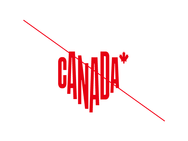
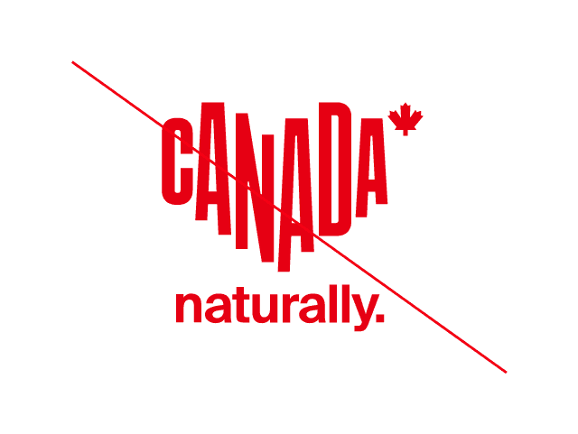
Official consumer logo
Our logo is bold and unmistakably Canadian. The type subtly forms a heart, reflecting our open hearts and the welcome we extend to the world.
It's all there: Canada, iconic red and a maple leaf. A clear expression of who we are and what we represent.
![]()
Official consumer logo
Our logo is bold and unmistakably Canadian. The type subtly forms a heart, reflecting our open hearts and the welcome we extend to the world.
It's all there: Canada, iconic red and a maple leaf. A clear expression of who we are and what we represent.
![]()
Reverse logo
In situations where the official logo can’t be used, the reverse logo—white on a red background—is equally impactful and can be used for optimal readability.
![]()
Reverse logo
In situations where the official logo can’t be used, the reverse logo—white on a red background—is equally impactful and can be used for optimal readability.
![]()
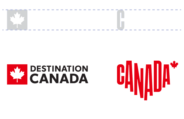
Minimum size
Below please find the minimum size for the consumer logo. Dimensions are given in millimetres (mm), inches (in) and pixels (px).
![]()
Minimum size
Below please find the minimum size for the consumer logo. Dimensions are given in millimetres (mm), inches (in) and pixels (px).
![]()
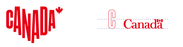
Protection space
The consumer logo must be surrounded by a minimum protection space that’s free of any other visual element. The basic measurement to be used is a square with sides equal to the width of the “C” in our consumer logo. For the consumer logo, one and a half squares are needed above and below, and two squares on either side.
![]()
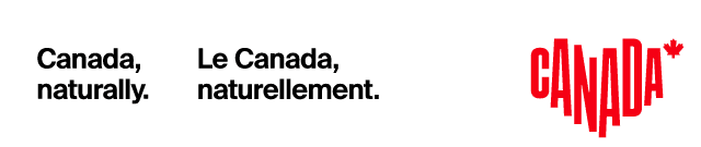
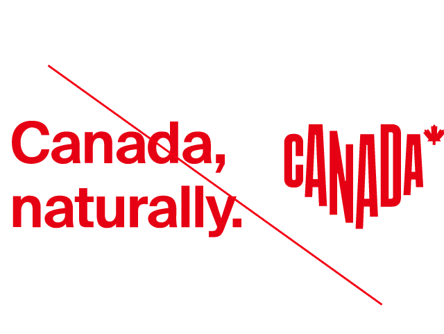
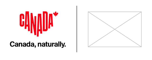
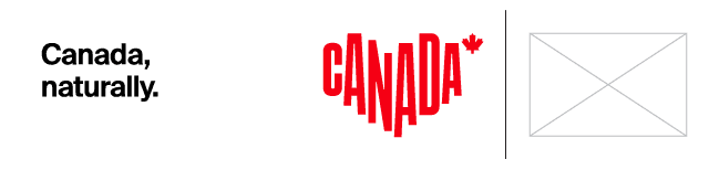
Canada, naturally. logo lockup
Tagline
Our consumer logo and tagline are designed to work in harmony, each reinforcing the other while remaining visually distinct. The tagline, Canada, naturally., expresses our brand essence with clarity.
While both elements contain the word Canada, this repetition is intentional. The logo and tagline are treated as complementary elements, placed with intention to ensure balance, legibility and impact.
Logo lockup:
![]()
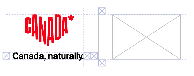
Horizontal
The horizontal logo lockup is the preferred version to use. It is modular, with the distance between the Canada, naturally. tagline and the consumer logo kept flexible to fit various asset sizes.
Rules
The consumer logo must be at least one logo distance away from the Canada, naturally. tagline. However, there is no maximum distance for how far apart the tagline and logo can be, making this lockup versatile for a wide range of applications.
The tagline should always be placed to the left of the consumer logo, unless the logo is used in sequence, or other graphic requirements favour placing the tagline on the right for legibility or clarity.
![]()
Vertical
A vertical logo lockup can be used in instances where the horizontal logo lockup does not fit, or where the vertical logo lockup is more aligned with how other logos are presented, such as on event sponsorship or co-branded applications.
![]()
Rules
The consumer logo should be one tagline above the Canada, naturally. tagline at all times. Unlike the horizontal lockup, the vertical lockup should not be adjusted in any way.
![]()
Logo lockup: colourways
There are four colourways available for the logo lockup. Use each as needed to ensure the lockup remains legible against different background colours or images.
![]()
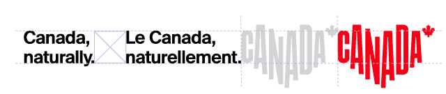
Bilingual tagline and logo lockup
While we always recommend using individual languages for each application, there may be cases where English and French are both required on the same application.
Rules
This lockup follows the same usage rules as the horizontal logo lockup in terms of spacing, scaling and positioning. The consumer logo should be at least one logo distance away from the Canada, naturally. and Le Canada, naturellement. taglines. There is no maximum distance for how far the consumer logo can be from the taglines.
The taglines should always be placed to the left of the consumer logo, unless the logo is used in such a way that it would be seen in sequence, or where other graphic requirements favour placing the tagline on the right for legibility or clarity. To determine the spacing between the English and French taglines, use the height of the tagline text (measured vertically) as the horizontal distance between them.
Canada, naturally. logo lockup
Tagline
Our consumer logo and tagline are designed to work in harmony, each reinforcing the other while remaining visually distinct. The tagline, Canada, naturally., expresses our brand essence with clarity.
While both elements contain the word Canada, this repetition is intentional. The logo and tagline are treated as complementary elements, placed with intention to ensure balance, legibility and impact.
Logo lockup:
![]()
Horizontal
The horizontal logo lockup is the preferred version to use. It is modular, with the distance between the Canada, naturally. tagline and the consumer logo kept flexible to fit various asset sizes.
Rules
The consumer logo must be at least one logo distance away from the Canada, naturally. tagline. However, there is no maximum distance for how far apart the tagline and logo can be, making this lockup versatile for a wide range of applications.
The tagline should always be placed to the left of the consumer logo, unless the logo is used in sequence, or other graphic requirements favour placing the tagline on the right for legibility or clarity.
![]()
Vertical
A vertical logo lockup can be used in instances where the horizontal logo lockup does not fit, or where the vertical logo lockup is more aligned with how other logos are presented, such as on event sponsorship or co-branded applications.
![]()
Rules
The consumer logo should be one tagline above the Canada, naturally. tagline at all times. Unlike the horizontal lockup, the vertical lockup should not be adjusted in any way.
![]()
Logo lockup: colourways
There are four colourways available for the logo lockup. Use each as needed to ensure the lockup remains legible against different background colours or images.
![]()
Bilingual tagline and logo lockup
While we always recommend using individual languages for each application, there may be cases where English and French are both required on the same application.
Rules
This lockup follows the same usage rules as the horizontal logo lockup in terms of spacing, scaling and positioning. The consumer logo should be at least one logo distance away from the Canada, naturally. and Le Canada, naturellement. taglines. There is no maximum distance for how far the consumer logo can be from the taglines.
The taglines should always be placed to the left of the consumer logo, unless the logo is used in such a way that it would be seen in sequence, or where other graphic requirements favour placing the tagline on the right for legibility or clarity. To determine the spacing between the English and French taglines, use the height of the tagline text (measured vertically) as the horizontal distance between them.
Tagline for international markets
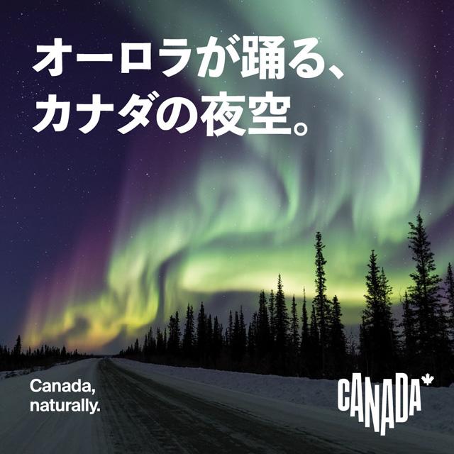
Japan
Translation:
カナダ、
ありのままの美しさ。
Preference is to use the English tagline whenever possible. However, the translation can be used in situations where additional context is needed. Brand assets must use English.
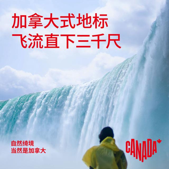
China
Translation:
自然绮境
当然是加拿大
Use the Mandarin tagline, or bilingual Mandarin and English taglines, with Mandarin in primary placement. Language laws in China require the use of localized taglines.
South Korea
Translation:
이게 바로,
캐나다
Preference is to use the English tagline whenever possible. However, the translation can be used in situations where additional context is needed. Brand assets must use English.
Germany
Translation:
Canada,
naturally.
Tagline to be used in English only.
France
Translation:
Le Canada,
naturellement.
Tagline to be used in French only.
Mexico
Translation:
Naturalmente,
Canadá.
Preference is to use the English tagline whenever possible. However, the translation can be used in situations where additional context is needed. Brand assets must use English.
Corporate logo
While the official consumer logo is used in traveller-facing marketing, the corporate logo represents our organization—Destination Canada—in all corporate, partner and sponsorship materials.
![]()
Corporate logo
While the official consumer logo is used in traveller-facing marketing, the corporate logo represents our organization—Destination Canada—in all corporate, partner and sponsorship materials.
![]()
Reverse corporate logo
![]()
Reverse corporate logo
![]()
Minimum size and protection space (corporate logo)
Below please find the minimum size and protection space for the corporate logo. The logo should always be at least 25 mm (1 in) across. To determine the protection space needed at any given size, use the height of the “C” in DESTINATION CANADA.
1. Minimum size
![]()
2. Safety margins
![]()
Pairing the corporate and consumer logos
The corporate logo can be paired with the consumer logo. The height of the corporate logo must be the height of the “C” in the consumer logo.
Canada wordmark
To be used by Destination Canada only, this wordmark is part of the Government of Canada’s Federal Identity Program, which allows for clear and consistent identification of government institutions.
Canada wordmark
To be used by Destination Canada only, this wordmark is part of the Government of Canada’s Federal Identity Program, which allows for clear and consistent identification of government institutions.
Minimum size and protection space (Canada wordmark)
Below please find the minimum size for the Canada wordmark as well as the protection space. The wordmark must always be surrounded by a standard protection space that is free of any other visual element. The basic measurement to be used when calculating the protection space around the Canada wordmark is a square with sides equal to the height of the “C.”


Pairing the wordmark with our other logos
The Canada wordmark can be paired with both the consumer and corporate logos. Be sure to respect the sizes of the wordmark indicated below.
1. When paired with the consumer logo, the height of the wordmark should be half the height of the logo’s “C.”
2. When the consumer and corporate logos are present, the wordmark should match the corporate logo. When paired with the corporate logo, the height of the wordmark should be the same as the height of the logo’s “C.”
Minimum size and protection space (Canada wordmark)
Below please find the minimum size for the Canada wordmark as well as the protection space. The wordmark must always be surrounded by a standard protection space that is free of any other visual element. The basic measurement to be used when calculating the protection space around the Canada wordmark is a square with sides equal to the height of the “C.”
Pairing the wordmark with our other logos
The Canada wordmark can be paired with both the consumer and corporate logos. Be sure to respect the sizes of the wordmark indicated below.
1. When paired with the consumer logo, the height of the wordmark should be half the height of the logo’s “C.”
2. When the consumer and corporate logos are present, the wordmark should match the corporate logo. When paired with the corporate logo, the height of the wordmark should be the same as the height of the logo’s “C.”
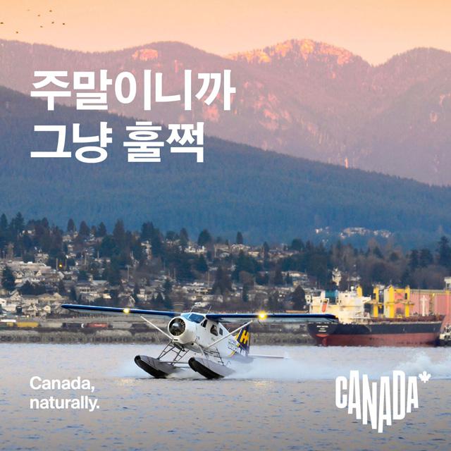
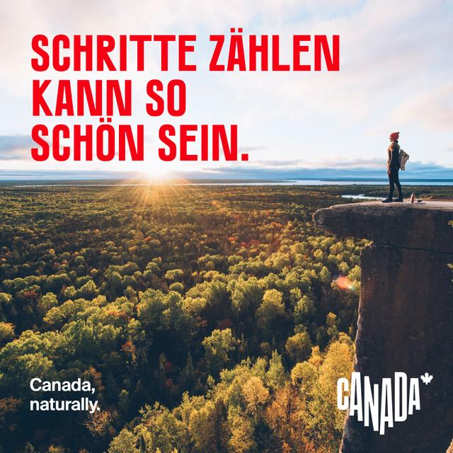
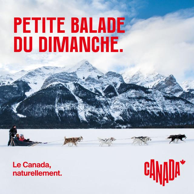
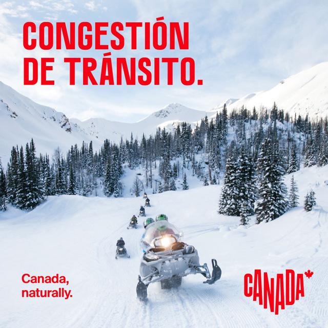
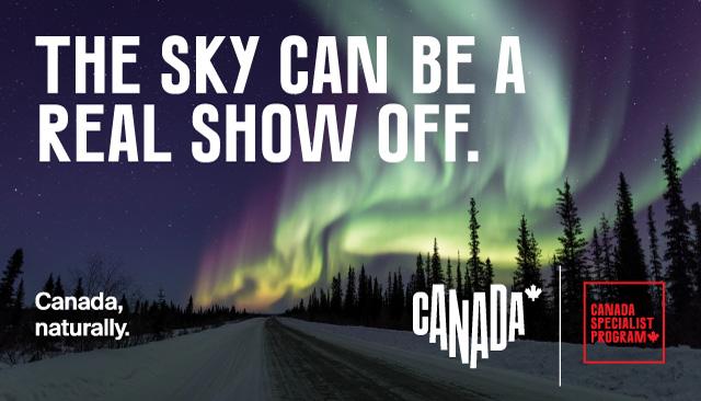
Official Consumer Logo placement
There is flexibility to place the consumer logo where it fits best. That said, it should always be placed where it has full visibility and the protection space is respected.
As indicated in the images below:
1. All type and logos should sit inside and along the margin.
2. When typography is an important visual element of a communications piece, the logo must be the same height as the lettering.
3. Allow room for the photography to shine and do not run type past the focal point of creative.
4. Logos must align to the bottom margin.
![]()
![]()
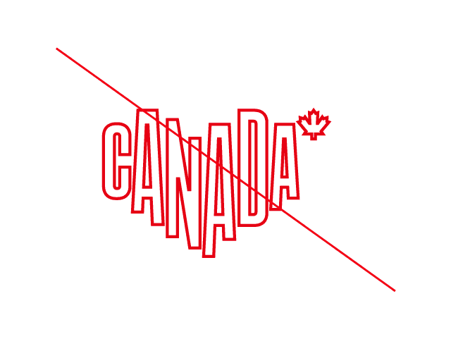
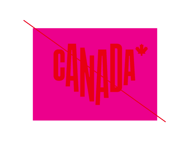
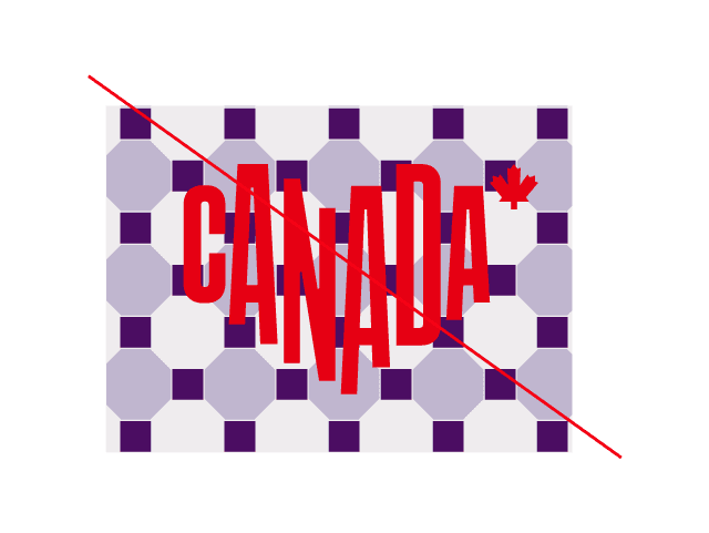
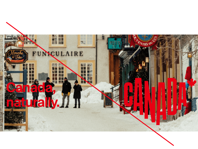
Don't even think about
1. Distorting the logo
2. Angling the logo
3. Using effects like a drop shadow
4. Changing the proportions
5. Rearranging logo elements
6. Using an outlined version
7. Placing the logo on a competing/clashing colour
8. Using a busy, patterned background
9. Isolating the logo in a box or shape
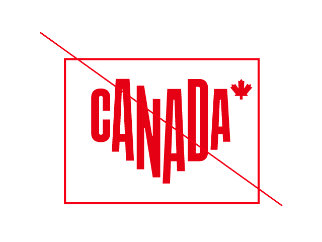
10. Placing the logo or tagline on a busy picture.
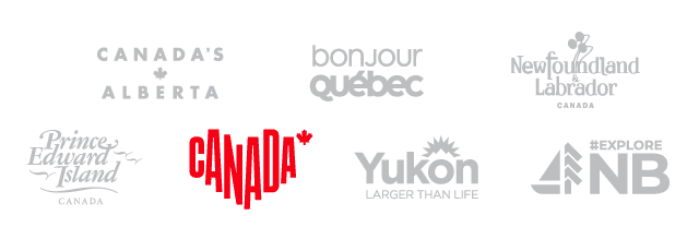
Partnerships and sponsorships
Whenever we team up with other partners, our logo should be proportionate in size and weight to the others that appear. Red should always be the dominant colour, Suisse Int’l should always be the font, and the protection space must always be respected.
1. Our logo must match the size and visual impact of all other logos that appear.

2. Red should be the primary colour.
3. Use our font, Suisse Int'l, whenever possible. Its versatility complements any brand.
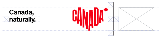
Sponsorship:
Partnership with official consumer logo:
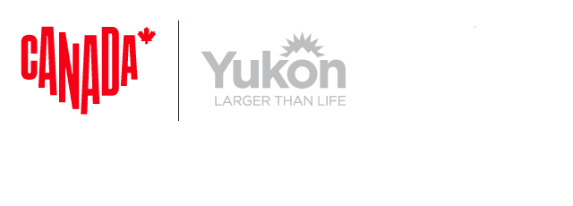
Partnership with Canada, naturally. logo lockup:
The vertical logo lockup can be used for logo lockups with partner logos.
Rules
The vertical logo lockup and the partner lockup should be equal in height. Use the line height of the Canada, naturally. tagline as a guideline for spacing. Separating the two logos is a vertical black or white line. This line is the height of the vertical logo lockup plus the line height of the tagline at the top and bottom. The logos should be twice the line height of the tagline away from the line.
The horizontal logo lockup can also be used for logo lockups with partner logos.
Rules
The horizontal logo lockup and the partner lockup should be equal in height. Use the line height of the Canada, naturally. tagline as a guideline for spacing. Separating the two logos is a vertical black or white line. This line is the height of the horizontal logo lockup plus the line height of the tagline at the top and bottom. The logos should also be one line height of the tagline away from the line.
Partnerships and sponsorships
Whenever we team up with other partners, our logo should be proportionate in size and weight to the others that appear. Red should always be the dominant colour, Suisse Int’l should always be the font, and the protection space must always be respected.
1. Our logo must match the size and visual impact of all other logos that appear.
2. Red should be the primary colour.
3. Use our font, Suisse Int'l, whenever possible. Its versatility complements any brand.
Sponsorship:
Partnership with official consumer logo:
Partnership with Canada, naturally. logo lockup:
The vertical logo lockup can be used for logo lockups with partner logos.
Rules
The vertical logo lockup and the partner lockup should be equal in height. Use the line height of the Canada, naturally. tagline as a guideline for spacing. Separating the two logos is a vertical black or white line. This line is the height of the vertical logo lockup plus the line height of the tagline at the top and bottom. The logos should be twice the line height of the tagline away from the line.
The horizontal logo lockup can also be used for logo lockups with partner logos.
Rules
The horizontal logo lockup and the partner lockup should be equal in height. Use the line height of the Canada, naturally. tagline as a guideline for spacing. Separating the two logos is a vertical black or white line. This line is the height of the horizontal logo lockup plus the line height of the tagline at the top and bottom. The logos should also be one line height of the tagline away from the line.
Logo pattern
For certain applications, for example, presentation slides or trade show booth walls, you may wish to present our logo repeated in a pattern. Below are the two approved formats for doing this.
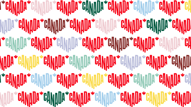
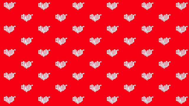
The logo can be staggered, but should always appear in a straight line. Secondary colours may be used, but as always, the red logo must be dominant.
Logo pattern
For certain applications, for example, presentation slides or trade show booth walls, you may wish to present our logo repeated in a pattern. Below are the two approved formats for doing this.
The logo can be staggered, but should always appear in a straight line. Secondary colours may be used, but as always, the red logo must be dominant.