Logo
Our official consumer logo is a reflection of Canada today, a study in movement and evolution. Here, we take the country’s pulse and feel a nation’s heart beating, expanding and retracting from our skylines to our forests.
Official Consumer Logo
Just like our beautiful country, our logo is a true original. In fact, the typeface was custom-designed and is always paired with Canada’s most iconic symbol—the maple leaf. The white logo on a red background evokes our heart, our passion and our pride.
Reverse Logo
In situations where the official logo can’t be used, the reverse logo—white on a red background—is equally impactful and can be used for optimal readability.
Logo on Red
Canada Red is our primary colour and should always feature prominently in every communication. When the background colour is red, the logo can be any other secondary colour from our palette, except black.

Logo on our colours
Other colours can be used to showcase the colours of Canadian landscapes throughout the seasons. When the background is a secondary colour, the logo must be red. Canada Red must always take centre stage.

Minimum Sizes
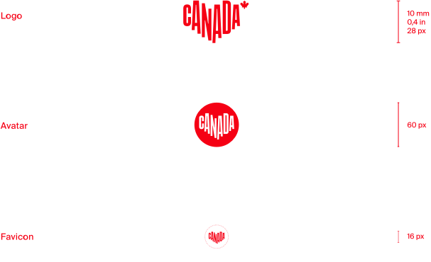
Below please find the minimum sizes for the various logo formats. Note that the avatar and favicon are to be used for smaller web formats only, and exceptionally don’t include the maple leaf element.
Protection Space
The logo must be surrounded by a minimum protection space that’s free of any other visual element. The basic measurement to be used is a square whose sides are equal to the width of the “C” in our logo. For the logo with the maple leaf, 1½ squares are needed above and below, and 2 squares on either side.
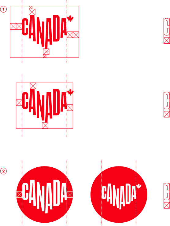
1 - The logo must be centered as if the maple leaf is not part of it, with the indicated protection space on all sides.
2 - The logo without maple leaf is only used in social media and uses the protection space as indicated.
Corporate Logo
The corporate logo’s usage is different than the consumer logo which is primarily to be used for the consumer market. Our business entity is Destination Canada, and that’s how we refer to ourselves in all corporate communications and sponsored content. This logo can be used in combination with other logos. This is the recommended RGB version of the logo.

Reverse Corporate Logo
Our colours run deeper than those found on our flag. They’re a declaration of who we are. And a bold reminder of our presence in the world.

Minimum Size and Safe Space Corporate Logo
Below please find the minimum size and safe space for the corporate logo. The logo should always be at least 25 mm (1 in.) across. To determine the safe space at any given size, use the height of the “C” in DESTINATION CANADA.

1 - Minimum size
2 - Safety margins
Pairing the Corporate & Consumer Logos
Pairing the wordmark with our other logos
The Canada wordmark can be paired with both the official and corporate logos. Be sure to respect the sizes of the wordmark indicated below.
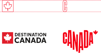
1 - When paired with the official logo, the height of the wordmark should be
½ the height of the “C.”
2 - When the consumer and corporate logos are present, the wordmark
should match the corporate logo. When paired with the corporate logo, the
height of the wordmark should be the same height as the “C.”
Canada Wordmark
To be used by Destination Canada only, this wordmark is part of the Government of Canada’s Federal Identity Program, which allows for clear and consistent identification of government institutions. We use this logo in combination with our other logos.
 .
. 
Minimum size and safe space Canada wordmark
Below please find the minimum size for the Canada wordmark as well as the protection space. The wordmark must always be surrounded by a standard protection space that is free of any other visual element. The basic measurement to be used when calculating the protection space around the Canada wordmark is a square whose sides are equal to the height of the “C.”

1 - Minimum size
2 - Safety margins
Logo Usage
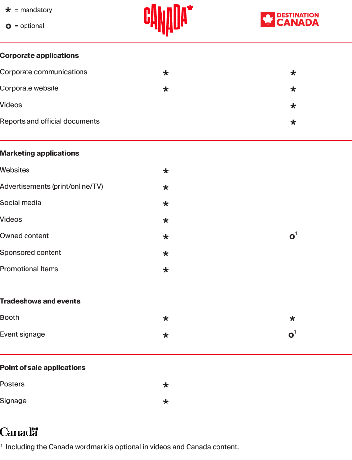
This table shows how to choose the right logo for any communications piece. Logo usage falls into two main categories: corporate and marketing. All corporate applications use the corporate logo and the Canada wordmark. For marketing, different logos apply according to the media in which they appear. Learn more about our logos in the following pages.
Logo Placement
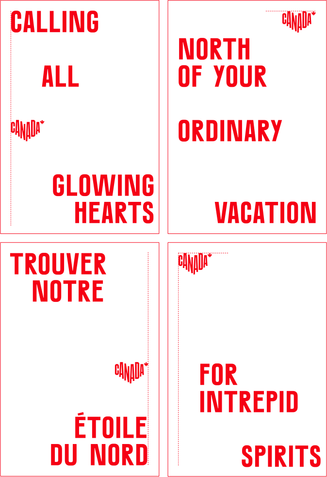
You have the freedom to place the logo where it fits best. That said, it should always be placed somewhere along a margin and be fully visible—and of course, the protection space of the poster margins must always be respected.
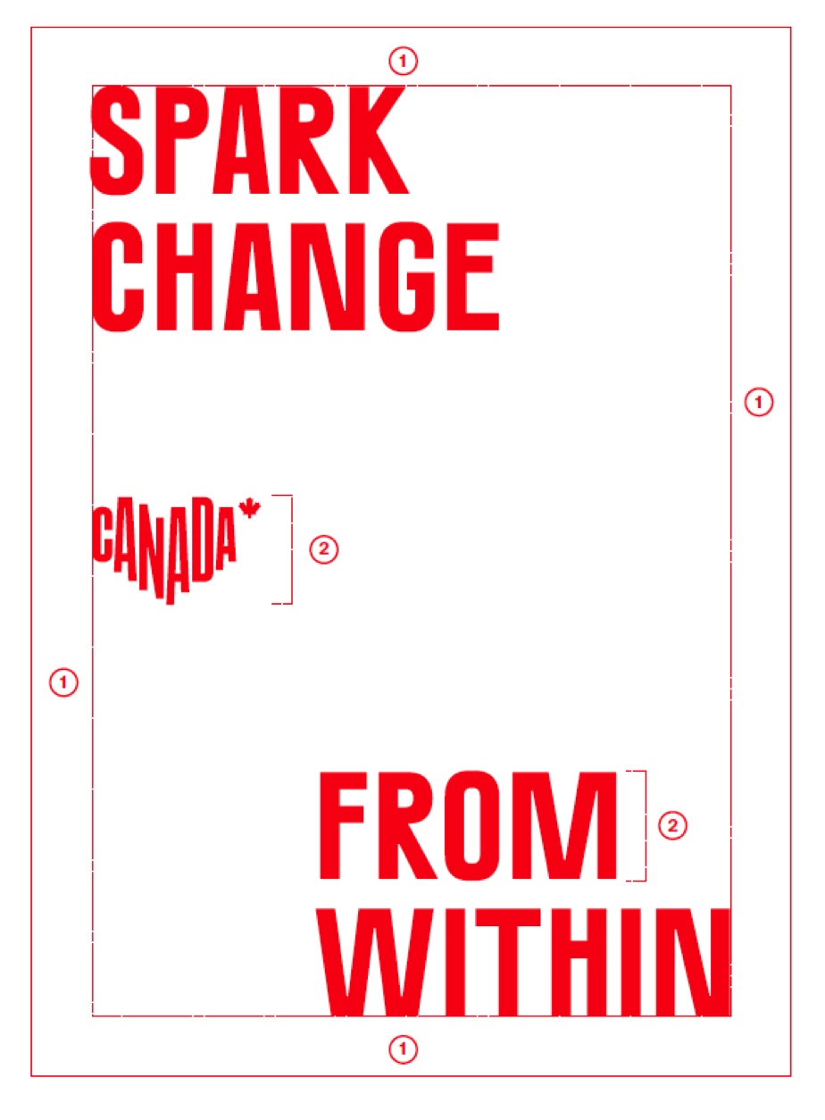
These layouts are for agencies only.
1 - The official logo should always be aligned along a margin
2 - When typography is an important visual element of a communications piece, the logo must be the same height as the lettering.
Don't Even Think About
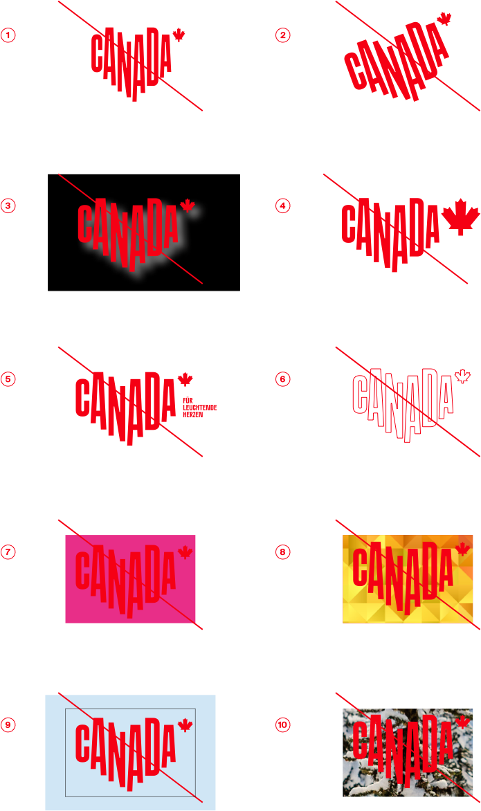
1 - distorting the logo
2 - angling the logo
3 - using special effects like a drop shadow
4 - changing the proportions
5 - changing the language of the tagline
6 - using a contoured version
7 - placing the logo on a competing/clashing colour
8 - using a patterned background
9 - isolating the logo in a box or shape
10 - placing the logo on a busy picture.
Partnerships & sponsorships
Whenever we team up with other partners, our logo should be proportionate in size and weight to the others that appear. Red should always be the dominant colour, Suisse Int’l the font, and the protection space must always be respected.
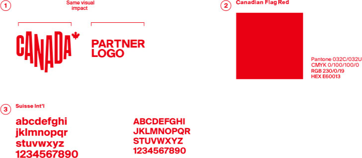
1 - Our logo must match the size and visual impact of all other logos
that appear.
2 - Red should be the primary colour
3 - Use our font, Suisse Int'l, whenever possible. Its versatility
complements any brand.


